Below is a chart that shows how family income has grown over time for families at different levels of initial income. For the sake of this post, let’s ignore measurement issues and whether or not these data accurately capture what is happening to the income of a particular person over time.
What you see below is a chart that separates families according to income quintiles (i.e. group the 20% of the poorest families together, then the next 20% richer, and so on up to the “richest” 20% of families), and follows how their family income has grown during two distinct periods (first, from 1966 to 1979, second, from 1980 to 2007).
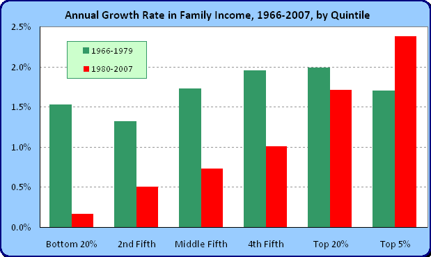
How might one interpret such a finding?
How do most commentators and economists interpret such a picture? Usually it goes something like this: “Up until the 1970s, income gains in the United States were shared equally by all, and since then, the benefits of economic growth have been captured only by the most well off Americans. America is in danger of having a huge amount of social unrest because of this growing disparity.”
“Solutions” to this “problem” run the gamut to increased subsidies for education, more regulation in the market, higher minimum wages, strengthening the bargaining power of unions, protecting certain domestic industries from foreign competition, raising taxes on the “wealthiest” Americans, and so on. We end up in a world where when we compete in a golf match against Tiger Woods, we make him play left-handed and blindfolded, rather than having him give us a few strokes at the start of the competition. Under which scenario do you think the golf will be more enjoyable for a spectator to watch?
In any case, you might profitably describe the above chart as saying that for all groups, including the top 20%, income gains seem to have slowed down (again, take the data at face value), but for some reason, they have slowed down even more for the bottom quintiles. A natural question would then be, why has economic growth slowed down for everyone? So it’s not that the “gains” from economic growth are suddenly being “distributed” unevenly … economic growth is not higher among the top 20% today than it was in period one, it seems that the lower rungs are not growing much at all. From the data, it would not appear that this lack of growth is because the top 20% is “taking” it from the lower rungs – if so, you’d expect to see growth accelerating for the top 20% (say, as you do for the top 5% … even then, are they “taking” it from the lower 95%?) – remember the pie is not fixed in size.
How would you profitably interpret this data? The data are from the Census and can be found here.