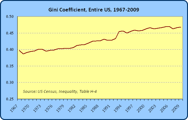
The chart below depicts a measure known as the “Gini Coefficient” for the entire United States from 1967-2009:
This is the image that people typically have in mind when they make claims that inequality in the United States is increasing. By this measure called the Gini Coefficient, it appears that income inequality increased by about 18% since the Johnson Administration (from an index value of .397 to .467).
Here is a totally stupid point to make, but you’ll see others make analogous ones when it comes to GDP or employment or some other measure. Interestingly, this inequality increased the most during Clinton’s 8 years in office (6.7%) followed by a 5.7% increase during Reagan’s 8 years. During the reign of King Bush the Second, it increased by 0.9%. Of course, I take these numbers to be fairly meaningless, and I recommend that you should too, but they do provide a salve for those of you frustrated by seeing similar data used by others.
OK, back to the Gini data above. As compared to other industrialized nations, by this measure inequality in the United States is basically higher than anywhere in the wealthy world. There is no reason to dispute the statistic. The point of the next week (or more) of posts is to help you understand what they really mean, and in what ways I might be concerned or unconcerned about some of them.
In the third post in the series (WINTERCOW: I changed a few things, originally I said this would run tomorrow) I will describe briefly 4 different ways of measuring inequality. In today’s post, all I want to do is point out the following:
- when examining the data above, remember that it is showing a particular way of measuring inequality (a relative inequality approach, which we will learn more about tomorrow)
- when examining the data above, remember that it is showing this particular measure of inequality for a particularly narrow attribute of the population. In this case, we are looking at the Gini Coefficient for Income – we could just as easily measure the Gini Coefficient for inches of hair grown per year. There are very likely to be many other measures of inequality that show “worse” trends, better trends, the same trends, that are more or less important
- when examining the data above, remember that this is showing a series of snapshots of the population over time, it is not following the same people over time
- The measure of inequality qua inequality is really not of much interest. The reason to think about inequality is to ask whether its changes relate to other important changes in the economy. Do increases in inequality mean that “opportunity” is reduced in an economy (reasonable people might interpret that to mean just the opposite)? Do increases in inequality make future economic growth more difficult? Do increases in inequality lead to more crime? Worse health outcomes? In other words, inequality is only important to the extent that it leads into a change in some real factor that we find important. The inequality number itself is no more important, on its own, than how you choose to arrange the books in your library.
- Pointing to an increasing number like this means little socially and empirically. What do economists know about the relationship between changes in inequality and other measures? We may, perhaps, explore that later on. Some people like to argue things like, “increased inequality means that social cohesion is fraying.” To which I can only say that I have no idea what that means. I could easily say that perfect equality means that social cohesion is fraying. Imagine that you worked in scorching sun for 14 hours per day while your neighbor sipped lemonades in the shade. At the end of the day, your incomes were equalized so that you both ended up with the same income. Please tell me how that is indicative of “social cohesion?”
We’ve already run this post too long. We’ll show a rough breakdown of how this Gini measure has changed within some subpopulations tomorrow, and then we will go into some simple explanations of what this measure means, and what we hope inequality measures can capture.

Another quick thought. When very poor Mexican immigrants come to this country, wouldn’t this increase the Gini number? When no one has seen any negative material changes in their lives?
Bullet three is certainly important. Should we expect to see a graph showing Gini coefficients for lifetime earnings tomorrow? I also wonder about the Gini coefficient for a single person’s earnings over the course of the person’s life (or even just working years). Those two data points would give some reference for whether a particular value is “high” or “low”.
Obviously the Czar and his family have too much wealth. Just take a look at St. Petersburg. I say we break all the windows in the Hermitage as an exercise in social justice.
Vote for Stalin [no other choices, sorry].
Your graph begins in 1967, shortly after LBJ’s Great Society, continuing through Nixon’s abolition of Bretton Woods, three big recessions, the creation of the Department of Energy and New Oil/Old Oil, gas lines fifty deep, the price of gold going to $800 in 1980, and a deliberate effort to diminish American influence in the world. During that time the line on the graph is flat, except for the brief tic down in 1967.
One conclusion is that if equality, defined by the graph, was unchanged by all of that smart intervention. Did I mention Gerald Ford’s Whip Inflation Now buttons, Nixon imposing a 55-mph speed limit, or Jimmy Carter wearing his cardigan sweater?
Looking forward to Wintercow’s next illuminating essay.
Meant to say if equality was unchanged, why did we have to go through all of that?
[…] Comments « Understanding the Genie in the Bottle, Volume I […]